UPDATE February 2015: This post is out of date. If you look up at the top of the page, you can see I’ve updated my logo again. This post is has been kept for posterity’s sake.
A designer’s biggest challenge is often developing their own logo/brand. Doing this work for a client seems so much more clear-cut. After working on my logo on-again-off-again for a number of weeks, I arrived at a solution that I felt represented me well.

The design is my reaction against slick “Web 2.0” style logos (i.e. the new Xerox logo, among others). This design harkens back to Lancaster City’s industrial past and the typographic styles from that era – some of which can be seen on the historic warehouses and business buildings around town. See some examples. »
I also decided to incorporate a descriptive tagline “Web. Print. Visual identity.” as part of the logo but it can also be shown without the tagline, depending on the context.

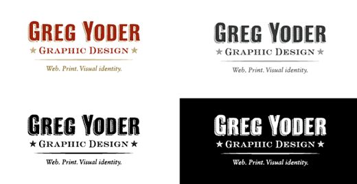
A good logo should be adaptable so that it can work well in color, grayscale, black and white, and white against a dark background as shown above. This is one of the things I always try to ensure whenever I am designing a logo for my clients.
