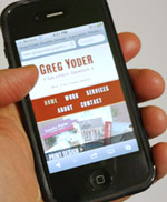
At long last, gregyoder.com has a new look and fresh content. For the last few years it was a classic case of “The cobblers children not having shoes.” My own website hadn’t been a good reflection of the skills and attention to detail that I put into practice for my client work. So that all has changed. Please take a look around. I plan to add project images and photos to this blog section of the site regularly, so keep checking back to keep tabs on what I’m doing.
It’s “responsive”

Built using HTML5 markup and the magic of CSS3 media queries, this site has been custom-designed to adapt to whatever device you are using to view it… whether an iPhone, a tablet, a desktop computer, or your TV. Test it out just by resizing your web browser window.
Not only business
In addition to project samples, I also plan to post technical information about creating/coding websites, as well as just some fun photos and entries from my life so you can get to know me.